The Rebranding Of Tailored Industry
Brands are constantly evolving. When Tailored was founded in 2017, the company values and brand represented the manufacturing side of the company. However, with the launch of the masks earlier this year and the coming launch of our debut in-house collection this Fall, Tailored Industry’s brand needed to evolve. We wanted a brand which communicates our commitment to our 4 core values: honesty through education, modern technology, a focus on essentialism, and collaboration with our customers. Additionally, we want both consumers and brand partners to understand our sincerity and commitment.
To help us with this effort, we hired an external brand strategist. Kevin Kurtovich and his company TheBrickSquare helped us define our needs and architect a new brand identity from the ground up.
Colors:
The first step of our rebranding process was to define a new color palette. Our strategy here was to select classic colors that are reflective of New York’s topography, with an accent orange twist (every palette needs a color pop). As a team, we decided to stick to timeless colors that can be used over and over again. Namely Heritage Blue, which we felt was a color that will be widely used in our upcoming capsule, and additionally in future marketing material. Lastly, we opted for 10% of Sustained Green to highlight our ethical production process.

Typography:
Next, we tweaked our typography. We knew we wanted a serif + san serif pairing to communicate our balance between modern, cutting edge practices and an aesthetic rooted in tradition and heritage. Our final choices were Playfair Display and Heebo. Previously, our Sans Serif font was Poppins. We wanted to choose a slightly less playful font that better fit our target demographic. Heebo is perfect as a friendly font that can be used in our email marketing material and on product pages. For titles, we wanted to use a serif font to communicate our sincerity and heritage roots. We decided to stick with Playfair Display, a beautiful Serif font that depicts luxury and heritage with high-contrast strokes; perfect for titles and headlines.

Logo:
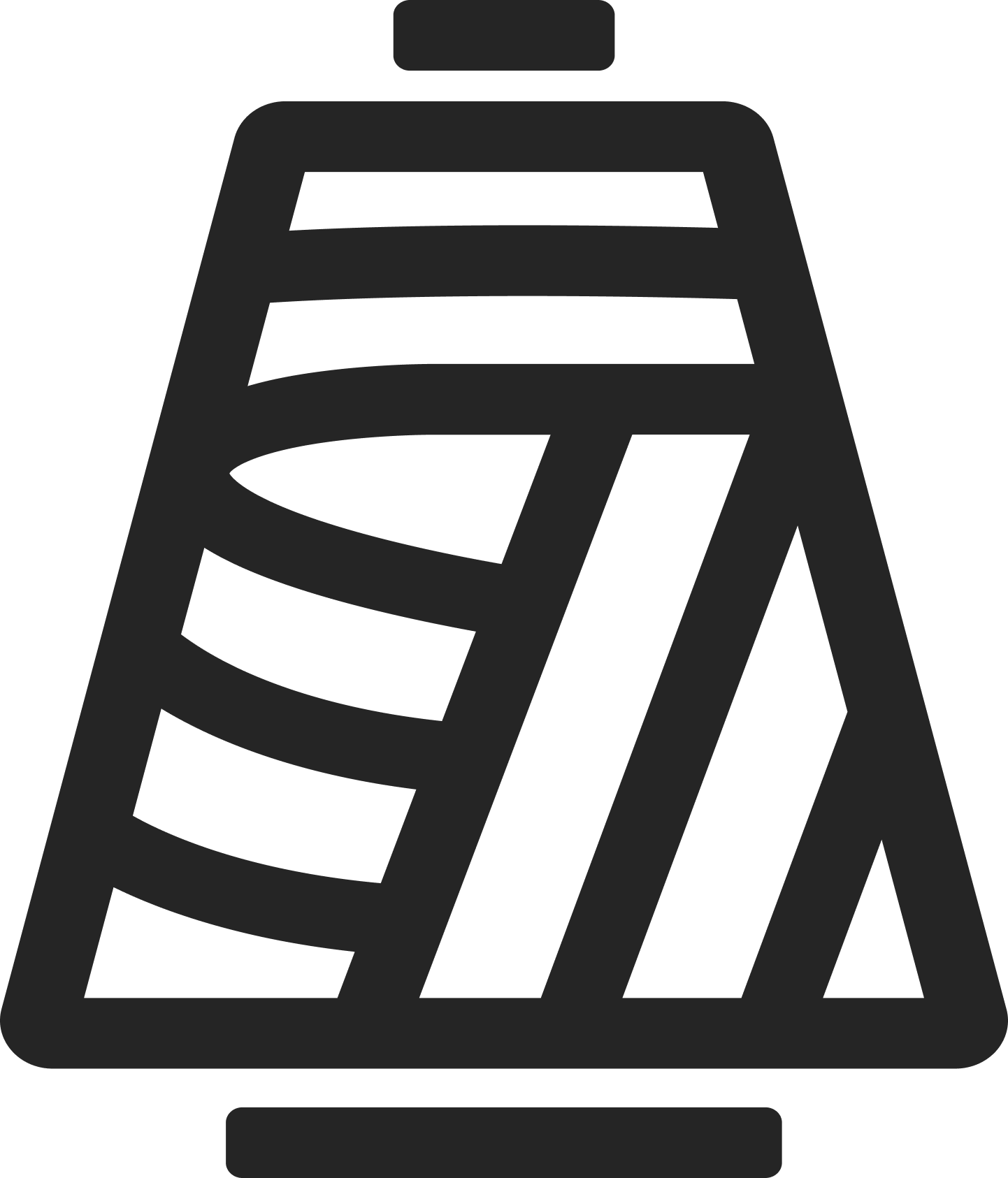
Designing Tailored Industry’s new logo needed extra research and judgment and was definitely the most challenging phase of our rebranding process. Kevin led the new logo design, starting off by compiling a table of options with custom fonts and unique styles. We researched the existing landscape to identify logo trends and patterns. While we could have played it safe, we decided to create a stand-out logo that was packed to the brim with meaning. Additionally, we designed a yarn-cone glyph that was reflective of knitting and our raw materials.


The sub-title reads ‘Brooklyn, NY’ to help communicate that we are an American-made brand in the heart of Brooklyn, bringing knitting back to the forefront of the American industry. Once the final logo and glyph were ready, we defined how and when each logo would be used in which platform/material.
New Website:
Another large part of the rebranding of Tailored Industry was to combine our previously separate consumer-facing shop and manufacturing websites. We strived to bring them together and create a harmonious experience that highlighted the interplay between the two halves of Tailored. The website redesign was led by our CPO and our design partners at BN Digital, who did a fantastic job of creating a new experience in a short timeframe. Marketing also played a significant role in the website design, considering customer journeys and ensuring the interface was friendly for the DTC side of the business. After hours of meetings, feedback rounds, and final tweaks, our new website was designed as one complete entity.
Bringing The Brand To Life:
Compiling all the branding we had worked on over previous weeks, it was time for Marketing to decide how Tailored would reflect our chosen brand values across social media channels, email marketing, and advertising. Applying the brand on social platforms played a large role in the strategic process—helping determine our themes and post style on Instagram.
It was essential to consider what our audience wants to see, the topics they would be interested in, and how we would portray our quintessentially NY-based brand. The general strategy was to post New York architecture and its geographical landscapes, and work with an external illustrator to create stop motion graphics and GIFs to story-tell our on-demand process.

The Future:
Now that the foundation has been set for our new brand as Tailored, we are excited to integrate the brand into our product line and future product launches. We continue to explore visuals and motion graphics which can help us communicate our brand values externally, and are excited to evolve the brand as we launch our on-demand technology platform in 2021!


